We are so excited to share our Mint Museum wedding design with you! We shared MacKenzie & Zach’s wedding story in our last post, and it was lovely and they were lovely, but oh my goodness, enough about them… let’s talk about this design!! 😉
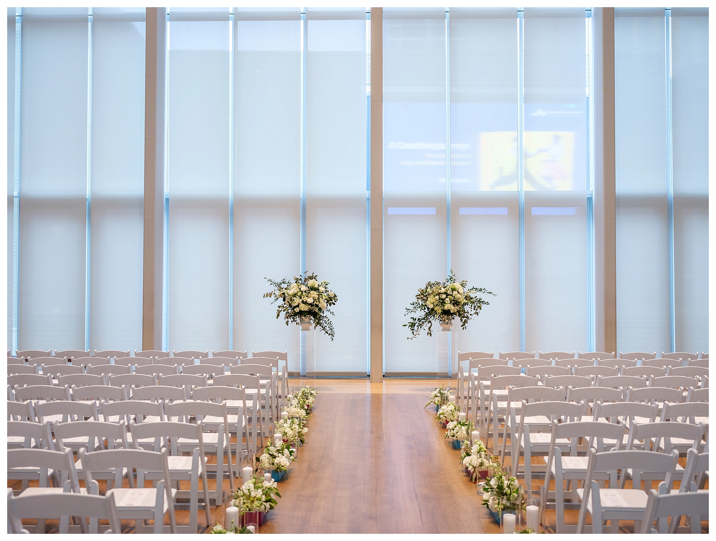
MacKenzie and Zach are both full of energy, and the space that they chose matched their energy in a way that made this design an absolute blast to visualize and execute. In addition to being an art museum full of life and color, the Mint Museum is also a beautiful blank canvas with clean lines and vast open spaces. In other words, a wedding designers dream! 😉
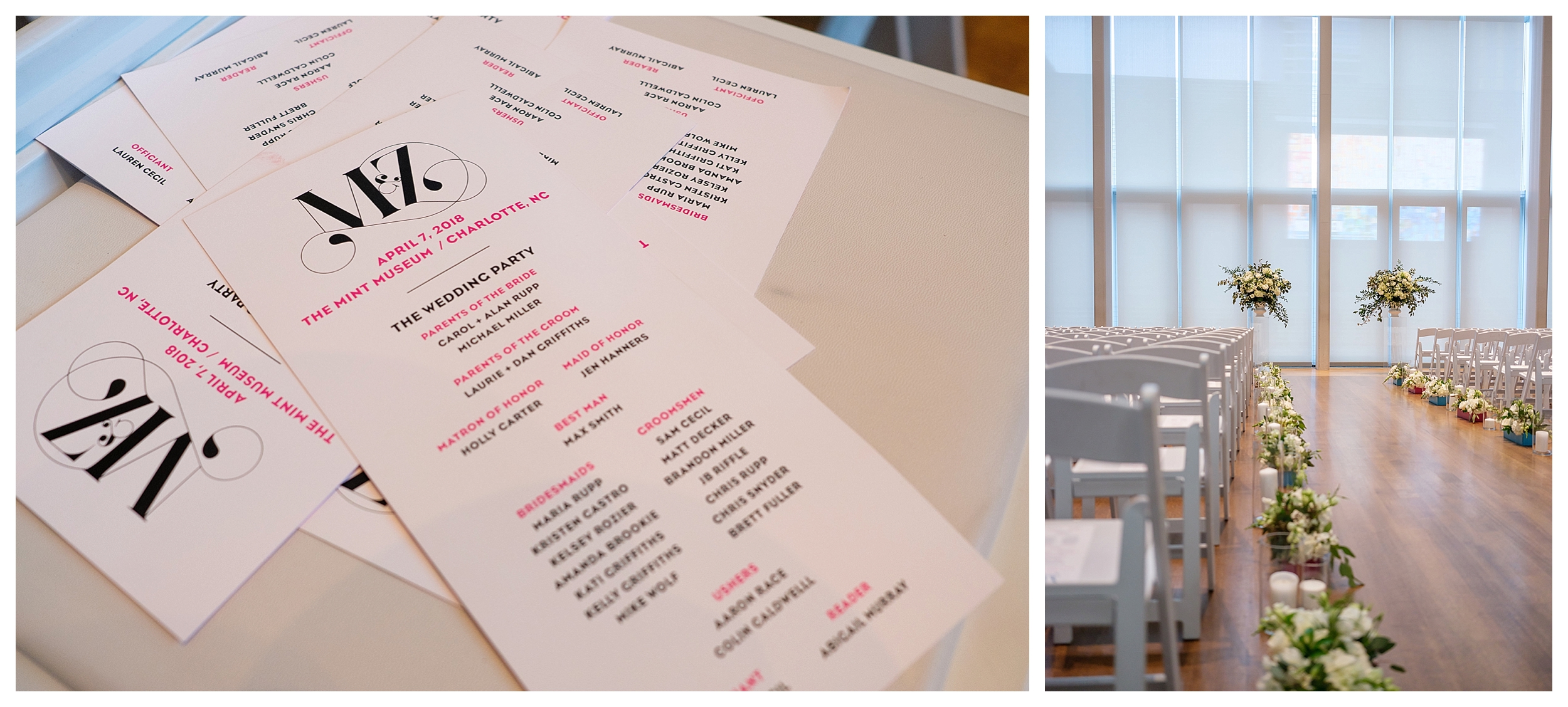
 And can we just say… the typography and graphic design for this whole wedding is perfectly on point.
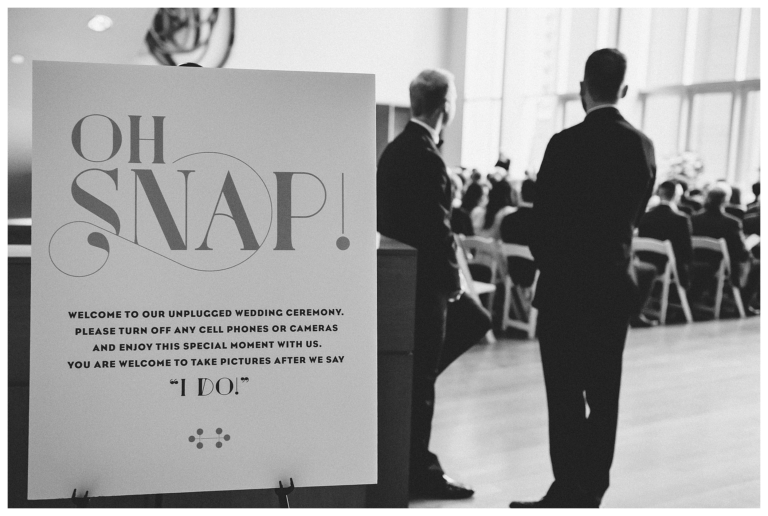
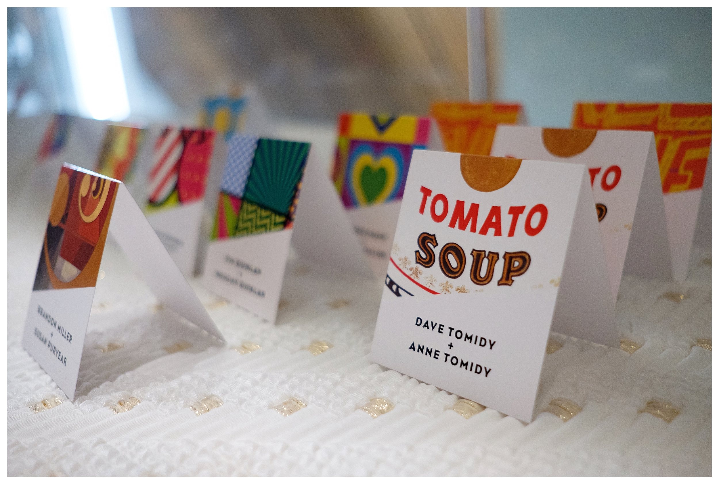
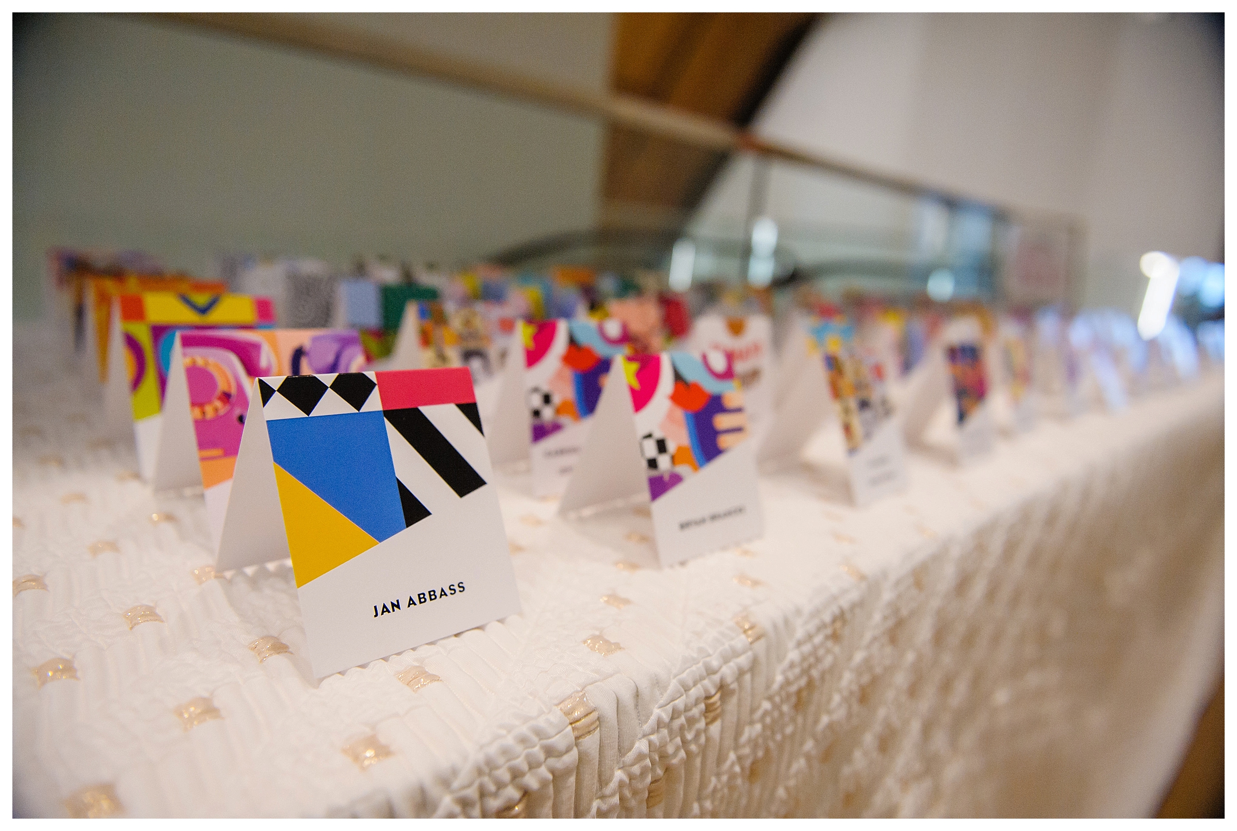
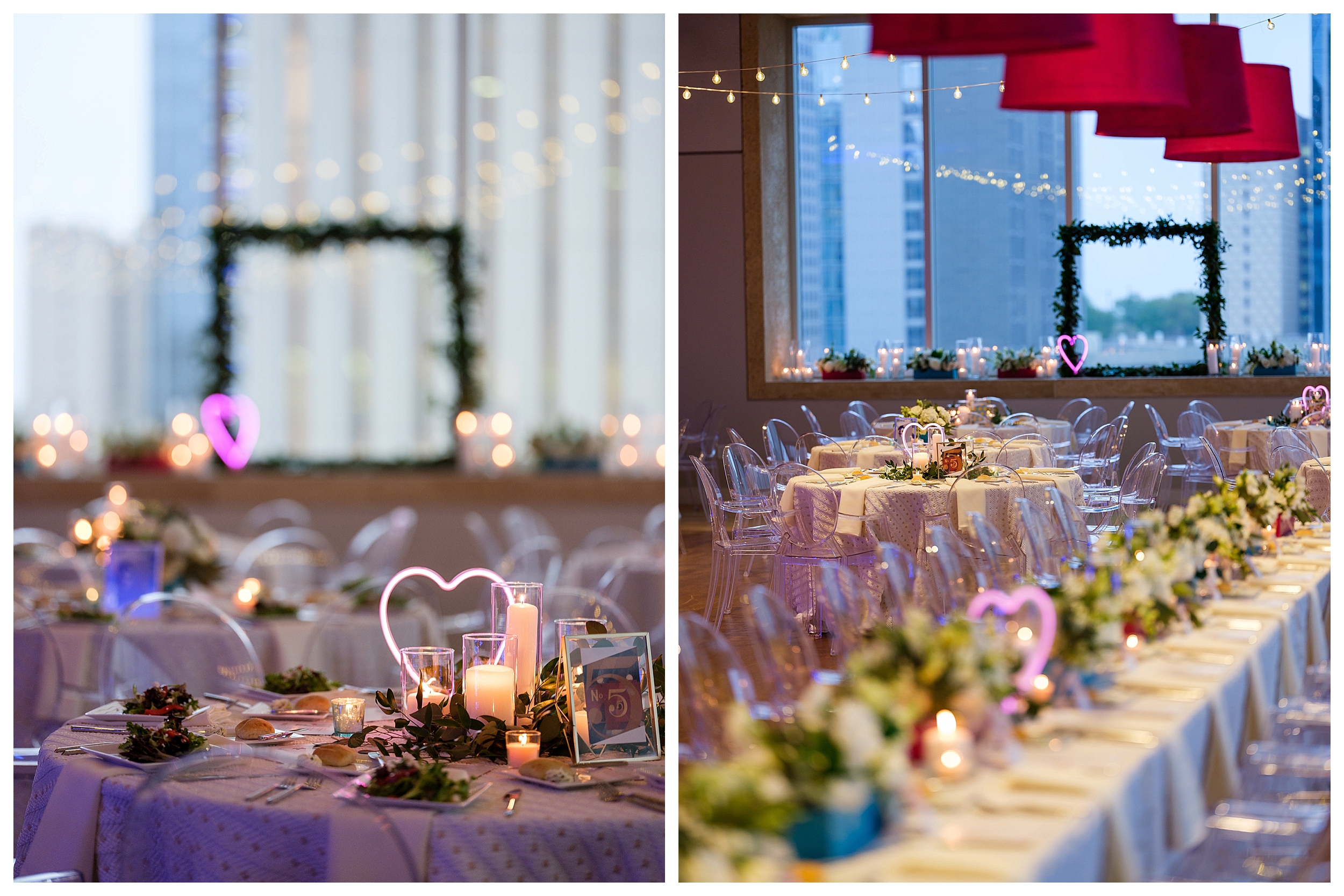
 Favorite detail #1: Rather than using clever names for their tables, we used art. Each table had an art print, and the escort cards had images that corresponded. Such a perfect way to kick off the pop art feel of the reception.
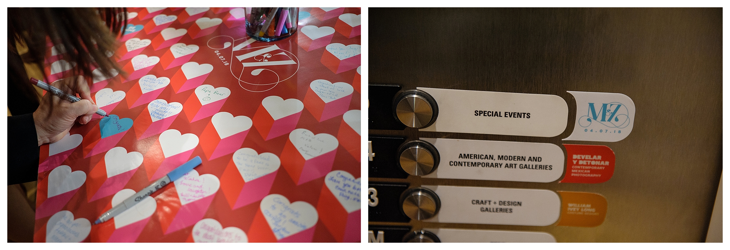
 Favorite detail #2 – Rather than going with a more traditional guest book, we had a piece of pop art on display, and each guests had the opportunity to add to that design. Super fun 🙂
Favorite detail #3- We had custom stickers made for the elevators. It’s the little things, y’all.
 Graphic design can have a huge impact on the cohesive feel of an event. We love seeing gorgeous typography functioning as pieces of art, all by themselves.
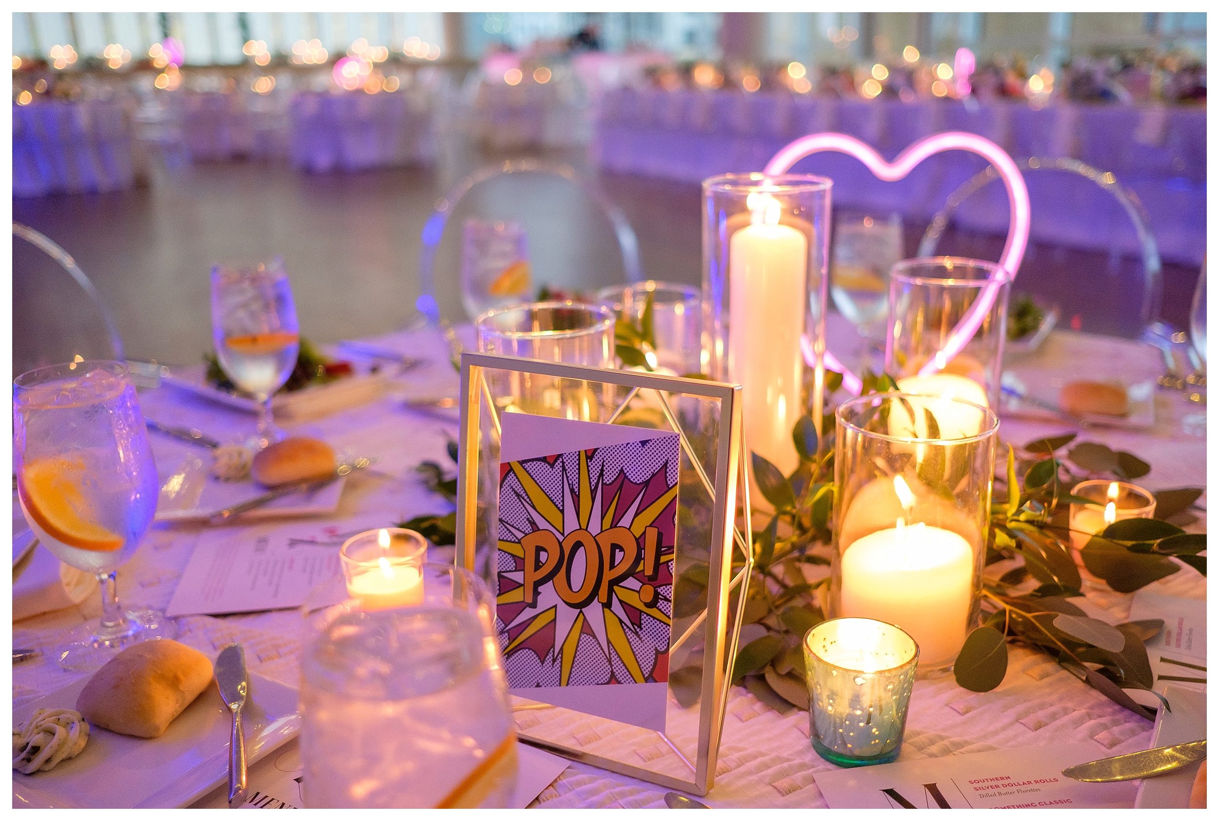
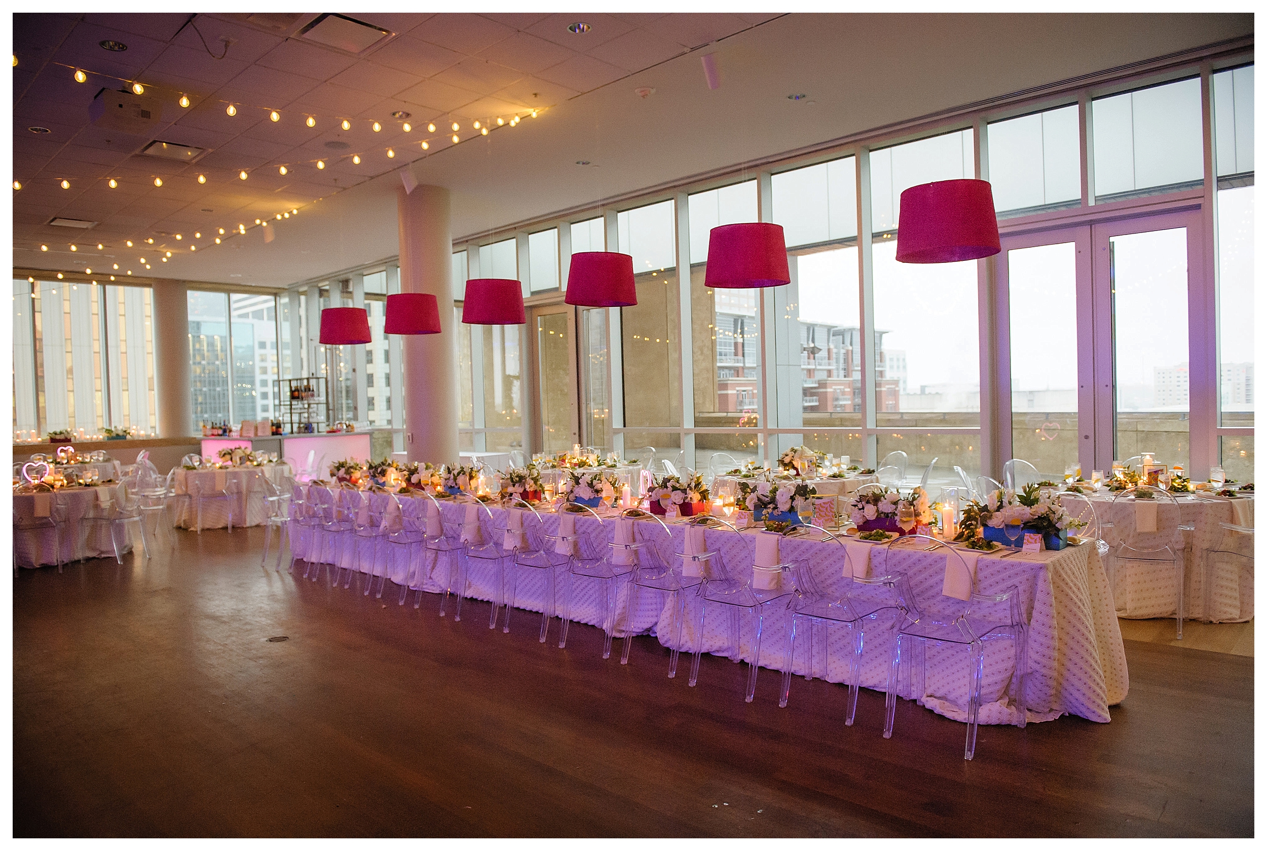
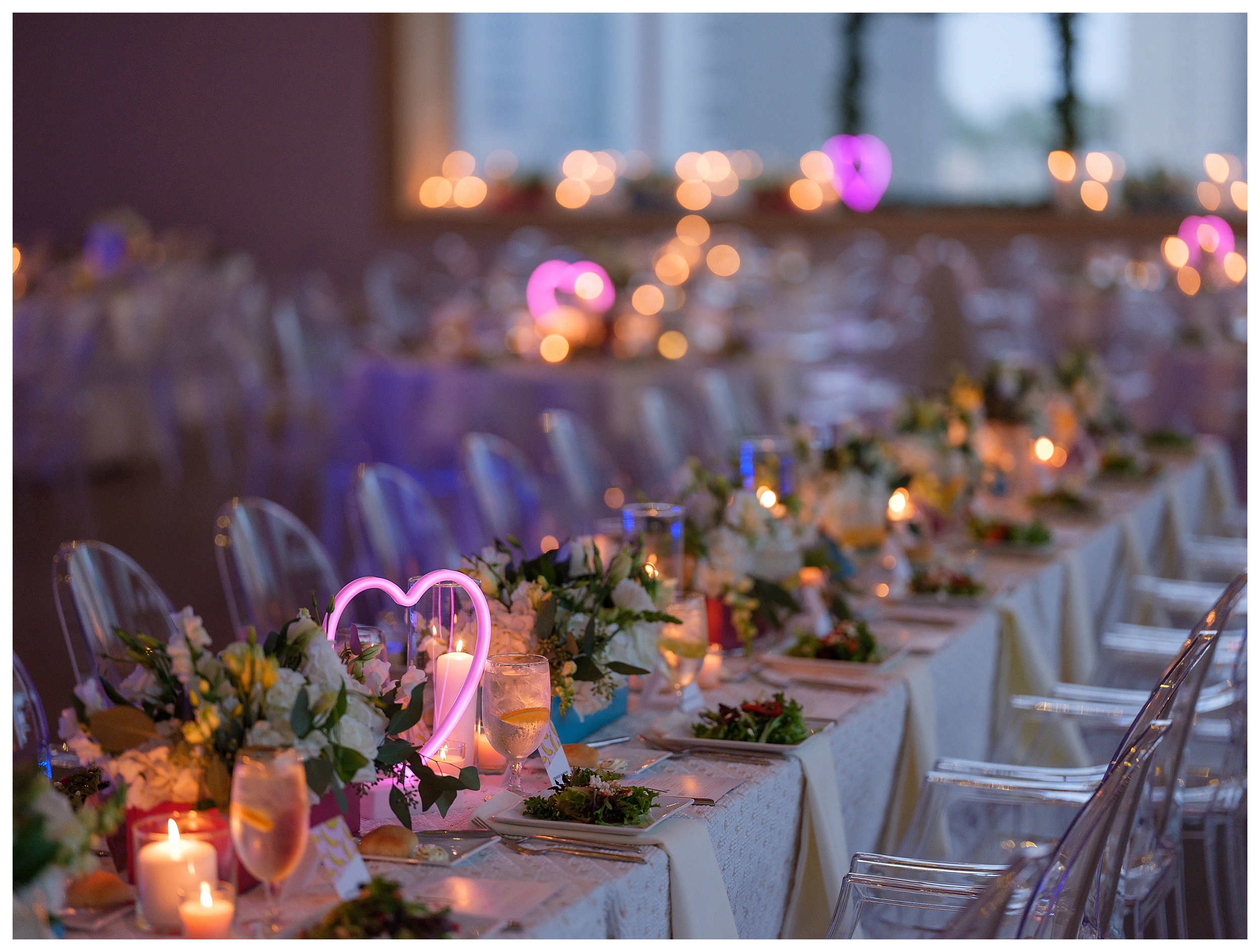
 Favorite detail #4: We love the way these neon lights accented this space. It was the perfect pop of color and light on each table. As a result, the room photographed beautifully!
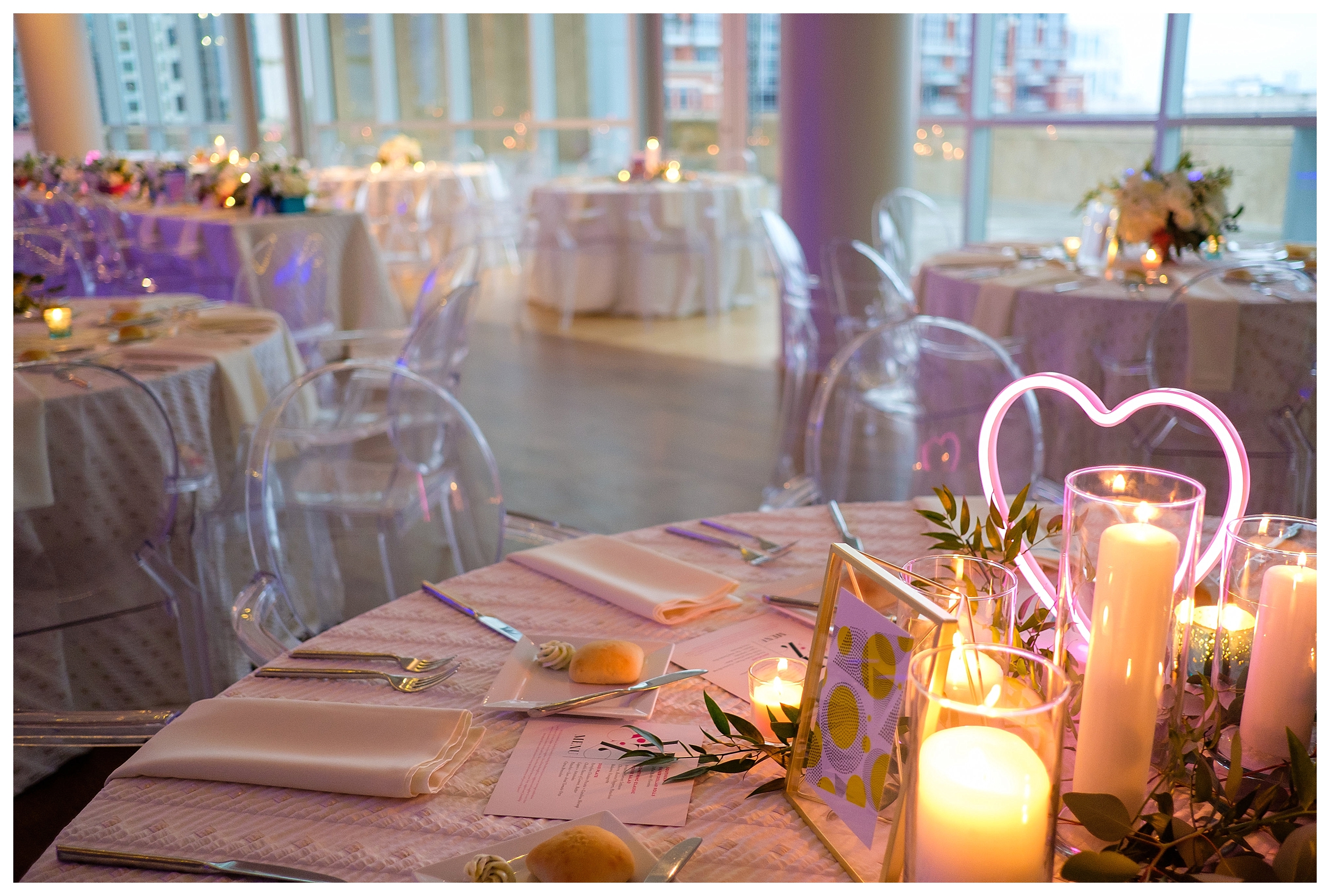
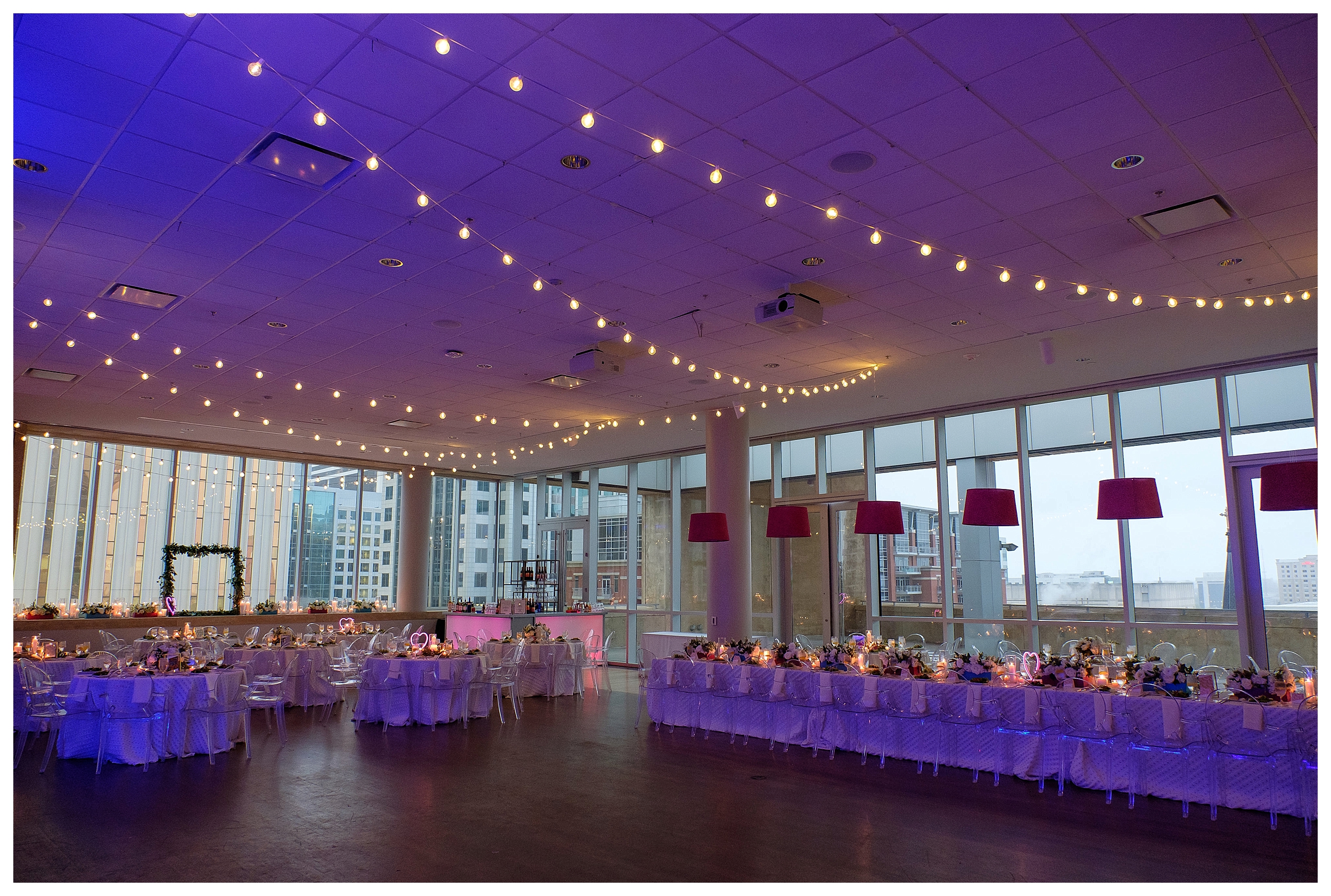
 Favorite detail #5: we had custom lamps made to highlight the head table. In addition to adding a pop of color and drama, these fun lights created an obvious focal point for the design.
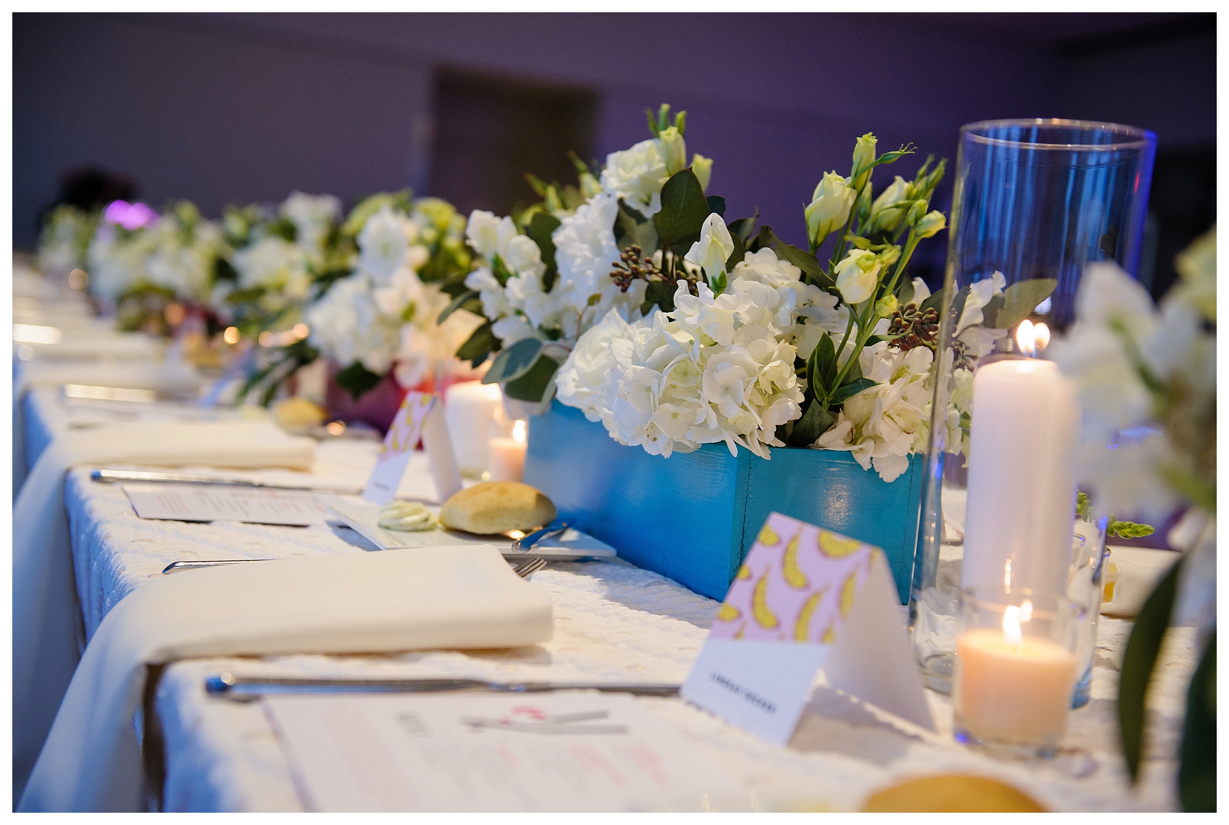
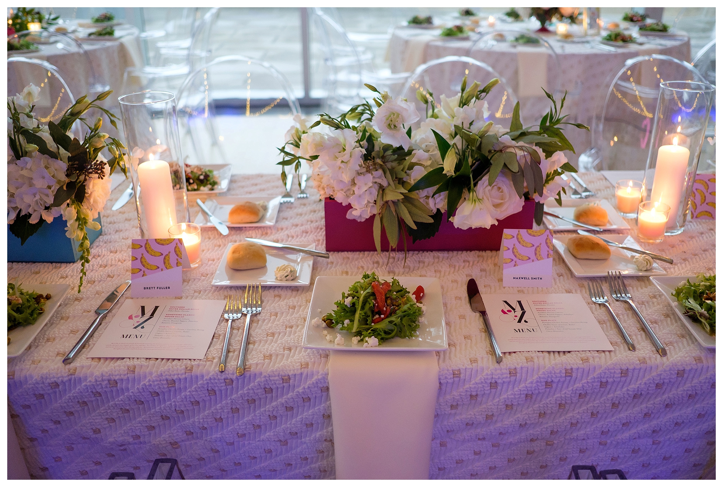
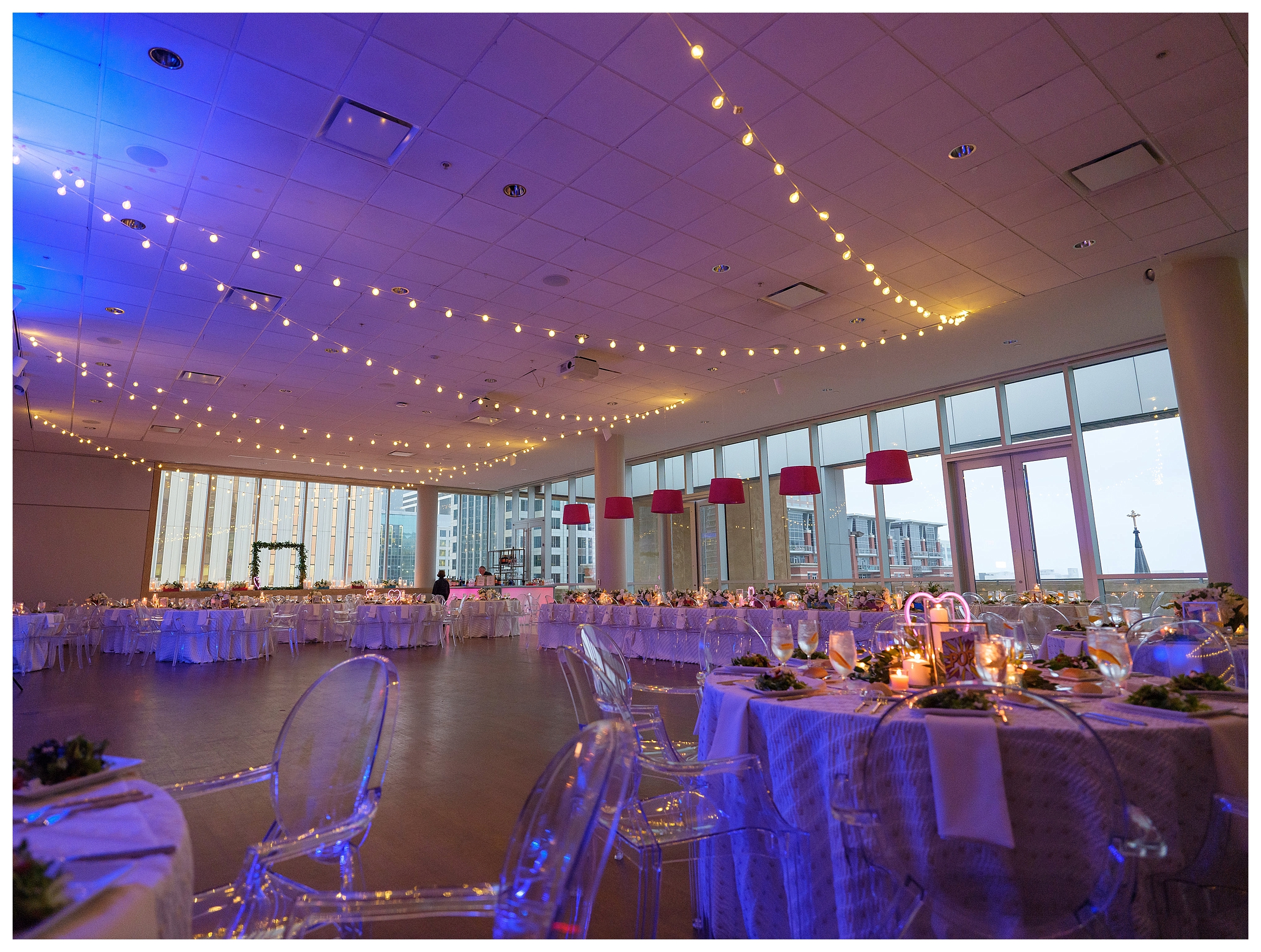
 The magic in this design is in the layers. We started with a blank canvas. We utilized structural pieces and simple linens as our base, and we mixed in pops of color highlighted by intentional lighting. Most importantly, our design was consistent. From the graphic design to the chair selection, each detail was considered.
As always, thanks to the fabulous team of vendors who worked so hard to make this Mint Museum wedding so stunning. We couldn’t have done it without you!
Shoots the World – Photographer
New Creations – Floral
Something Classic – Caterer
Heart Stone Films – Videographer
Mint Museum – Venue
Dean’s Duets & Quartets – Ceremony Musicians
The Fifth Divine – Reception Musicians
Mirror Bomb – Hair Artist
Erin Ashley – Makeup Artist
Charlie Paper – Graphic Designer
